
Aligning metric frequency to your use case
Creating metrics in Visible is a foundational piece of your account. The metric frequency you designate impacts how you can collect information from your Portfolio companies, how data is organized in your account, and how you are able to visualize data in your account.
There are three primary areas of Visible where metric frequency comes into play:
Below we walk you through how metric frequency touches each of these areas in the platform.
How metric frequency impacts Requests
How you set your metric frequency impacts the way you are able to request data from your portfolio companies. 70% of Investors using Visible are requesting data on a quarterly basis, but the platform's flexibility enables you to request it weekly, monthly, quarterly, and annually.
The metric frequency will ultimately determine how your company is being asked for data in Visible, and the period that will be asked for is dynamic based on the due date of the Request. Below we show you the different options based on the frequency.
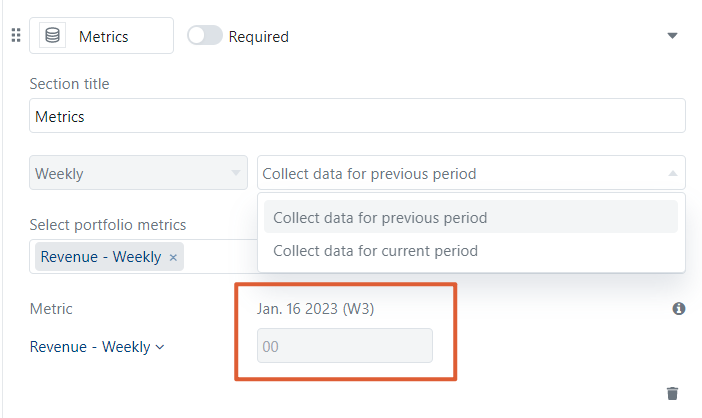
Weekly -- You are able to collect data for the previous or current week. The week is noted with the date and week number of the calendar year.
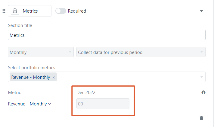
Monthly -- You are able to collect data for the previous or current month.
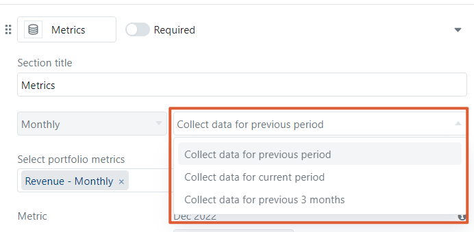
Note: If the Request schedule is set to recur quarterly, you have the ability to ask for the current month, previous month, or previous three months.
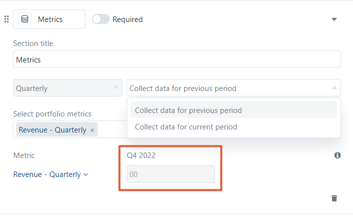
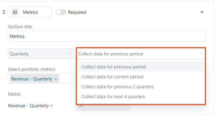
Quarterly -- You are able to collect an entire quarter's worth of data for the previous or current quarter.
Note: If the request is set to recur semi-annually, you have the ability to ask for the previous period, current period, previous two quarters, or next four quarters.
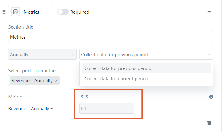
Annually -- You are able to collect a full year's worth of data.
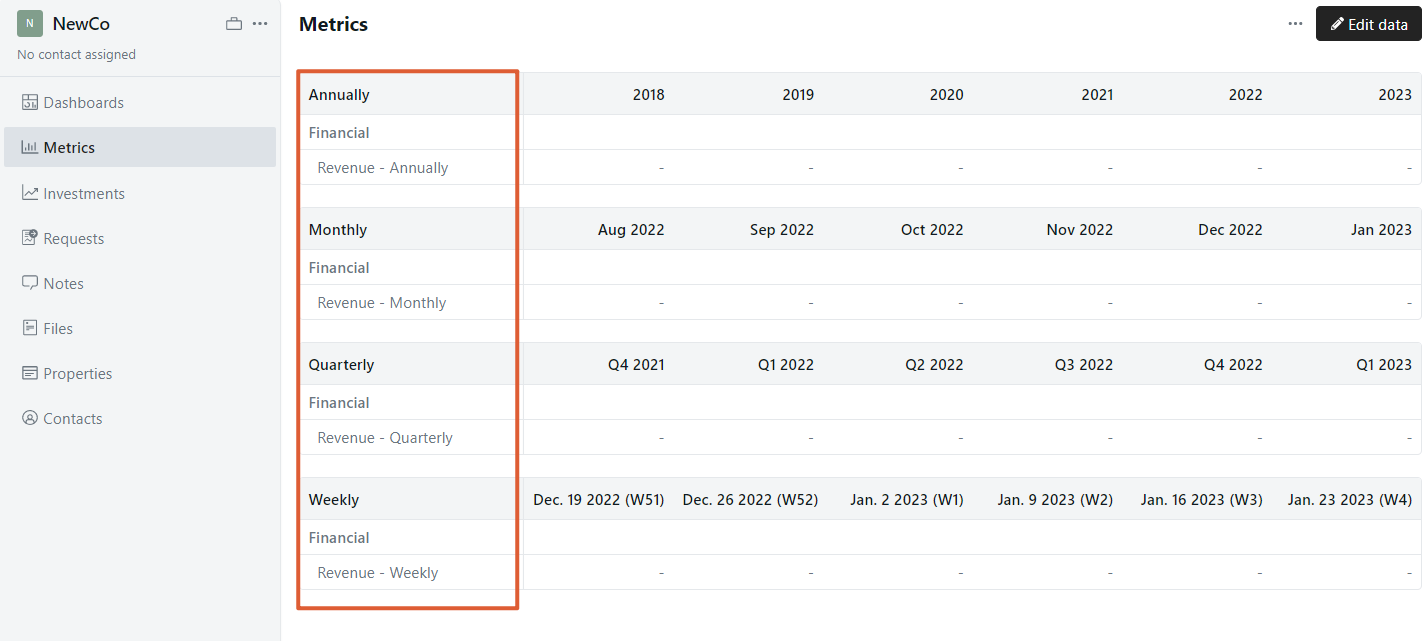
How metric frequency impacts how data is organized
All data ultimately lives within a company's profile, and metrics are grouped according to the frequency set.
How metric frequency impacts data visualizations
Visible dashboards are a flexible way to visualize data that you've collected from your companies. Within dashboards, you are able to aggregate data based on how you've set your metric frequency. You can roll-up data to a higher frequency -- e.g. view monthly data summed by quarter -- but not the other way around.
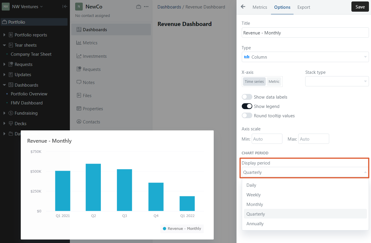
In the example below, there is a bar chart showing revenue set to a monthly frequency. By default, the chart period is set to aggregate monthly.
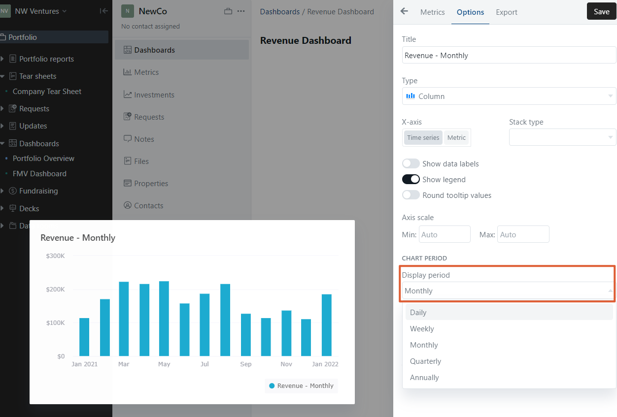
If I prefer to visualize this data quarterly, I can easily toggle to quarterly to see the data summed by quarter.
I cannot, however, visualize monthly revenue at a lower frequency -- e.g. weekly or monthly -- because this would disaggregate the data and result in inaccuracies.
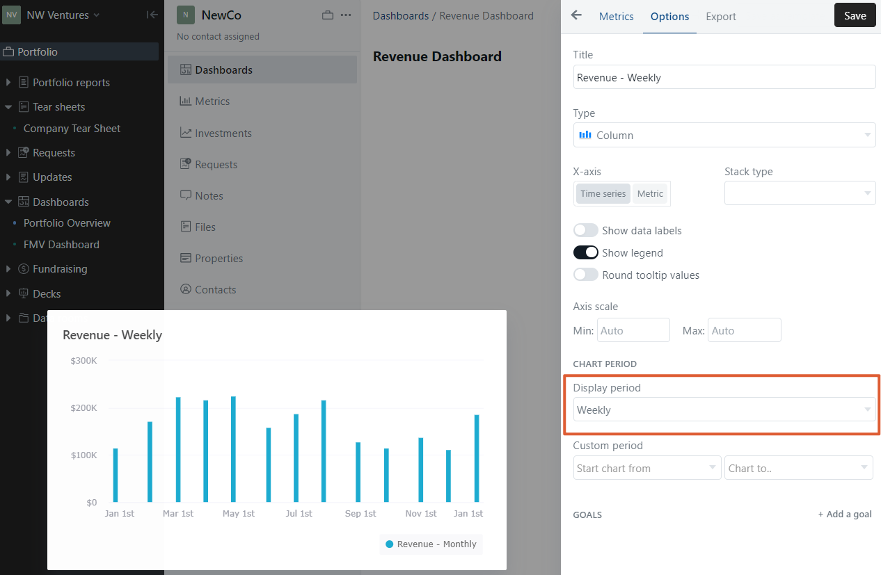
An error alert shows indicating that the data will not be visualized accurately. This is because I am disaggregating data by trying to break monthly data into a weekly format.
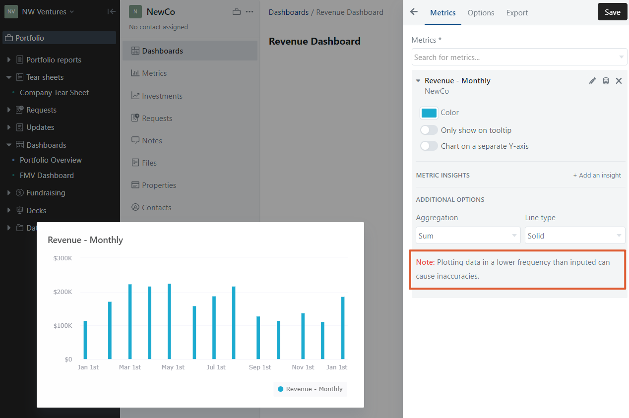
This holds true across any sort of disaggregation. In other words, you cannot visualize data at a lower frequency than inputted.
Please let us know if you have additional questions!