
This article should help you to round data labels on your chart or table. It should help with viewing and will round your data as averages (e.g. $9.5m)
To round the data labels on your chart, you will want to open Visible and open the dashboard where your chart lives. Click on the three dots in the top right corner of your chart and click Edit. Click Options along the top of your chart builder and toggle on Round data labels. Remember to click Save in the top right of your chart builder. These should limit the amount of characters in your label and make it easier for viewing purposes. This also works for data labels on tables too.
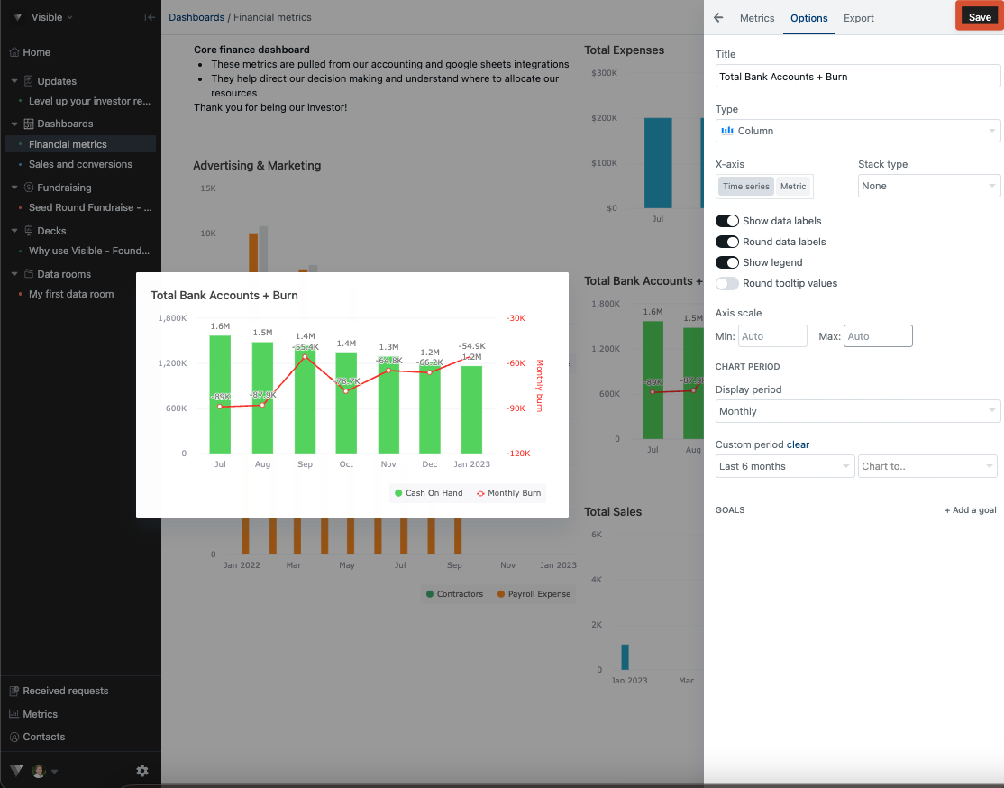
See below for screenshots of this process.
Open Visible
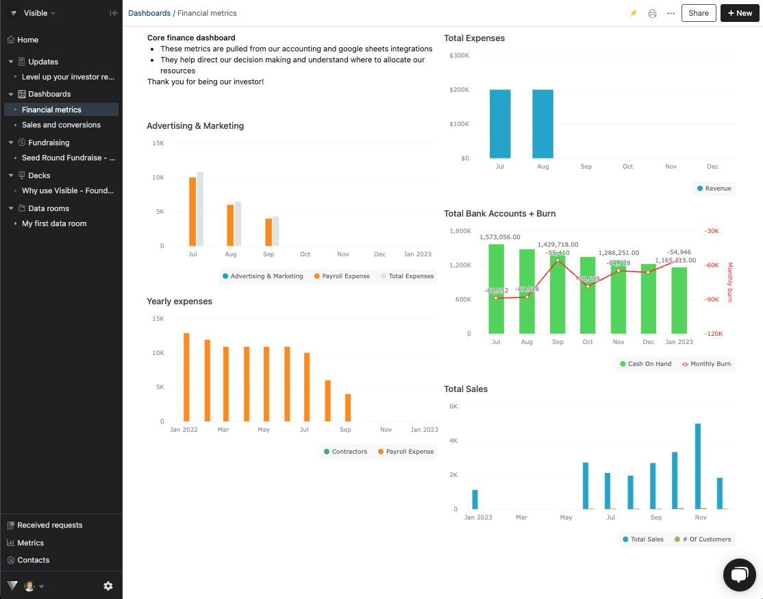
Open the dashboard where your chart lives
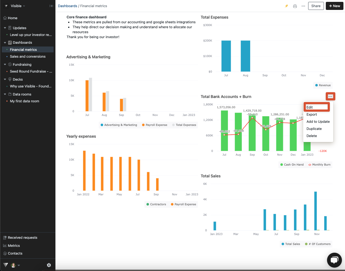
Click the three dots in the top right of your chart and then Edit
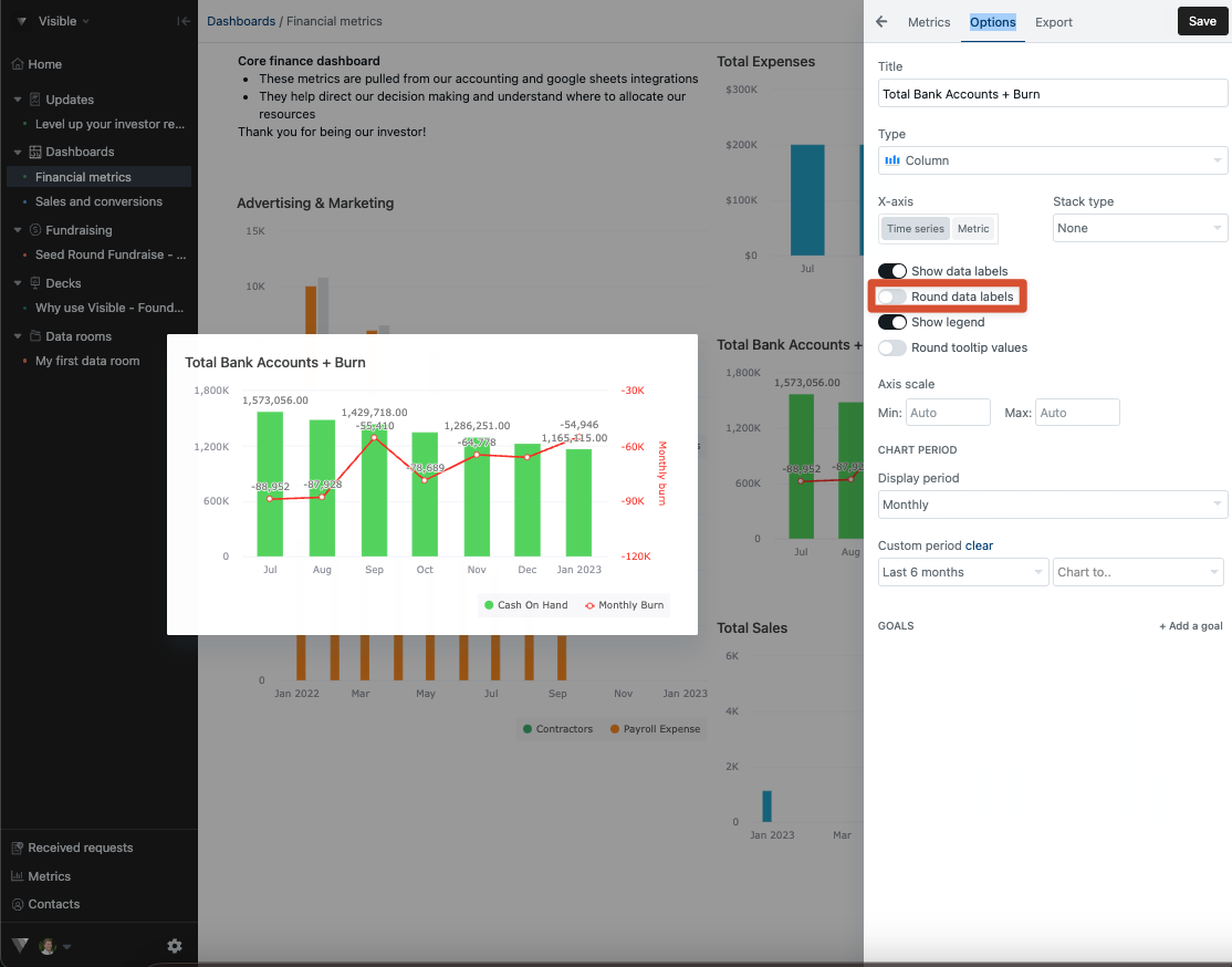
Click Options along the top of your chart builder
Toggle on Round data labels
Click Save in the top right of your chart
Please let us know if you have any additional questions