
How to use metric insights in charts, tables and formulas (% Changes, YoY Changes, Rolling Averages, Trailing Periods)
Overview
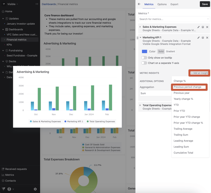
For each metric you track in Visible we automatically calculate twelve additional insights that you can use in charts, tables & formulas.
-
Change % (growth between periods)
-
Previous period change (absolute value change between periods)
-
Pervious year
-
Yearly change %
-
YTD
- Prior YTD
- Prior year YTD change
- Prior year YTD change %
- Trailing Average
- Trailing Sum
- Leading Average
- Leading Sum
- Cumulative Total
Charts
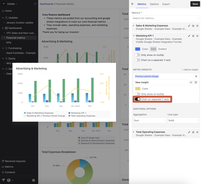
To add a metric insight to a chart. Open Visible. Navigate to your dashboard and create or edit an existing chart
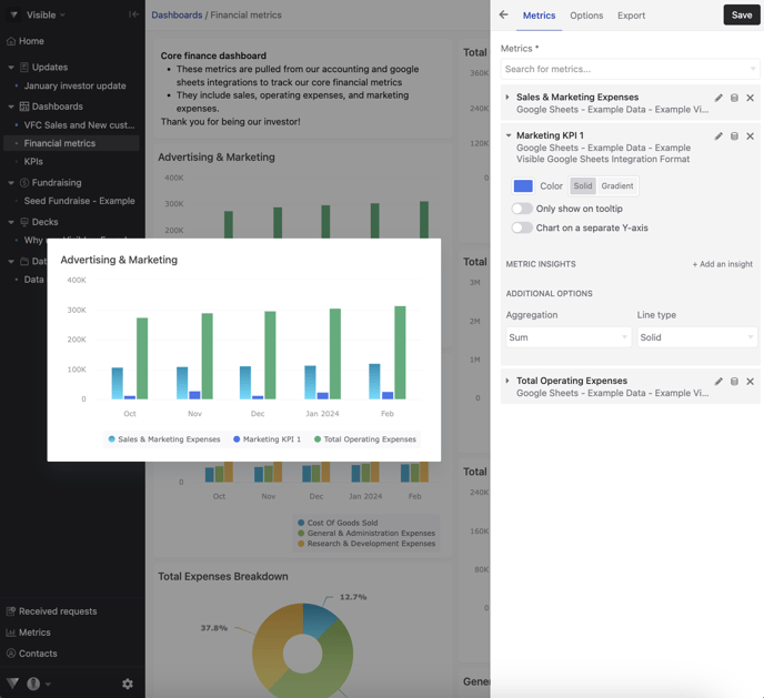
Click + Add an insight and choose what calculation you want to add to your chart
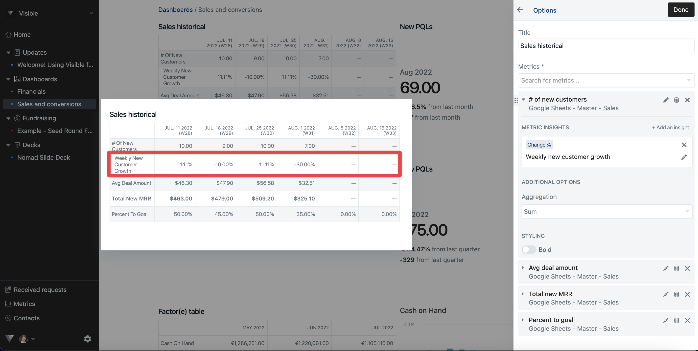
Renaming an insight
To rename an insights just click the pencil icon, rename the insight and click the check mark (note: this only renames the insight for the given chart/table)
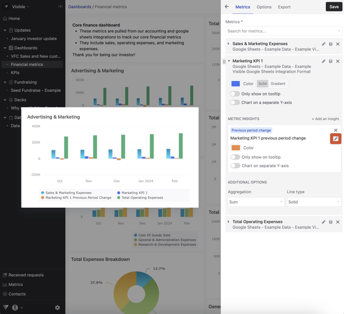
Change the color of the metric insight
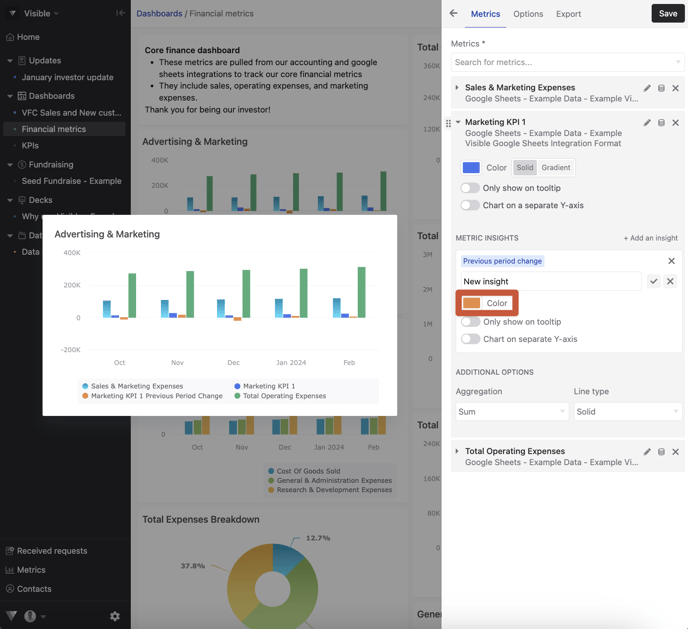
Chart on separate axis or show only in the tooltip
For each insight, you have the option to chart on a separate axis or only show in the tool tip hover. This will help you to highlight multiple metrics on a single chart
Tables
Insights can be used in tables. They will be added a sub-row to the primary metric.
Metric insights and getting the most out of graphs and charts can be complicated.
Please reach out to our team if you have questions.